by Dan Gonzalez
Commitment to Design
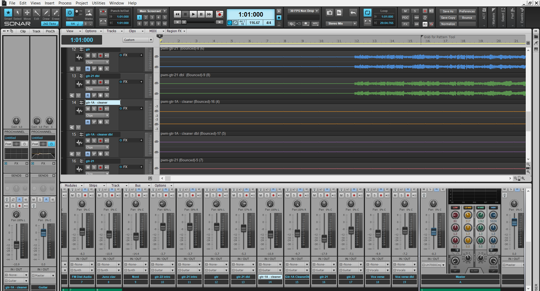
As SONAR fanatics, we tend to constantly improve and optimize our interface to make it more fluid and user-friendly. In the new SONAR, our sends and fx stacking have taken on a new look to better suit the needs of the modern day mixing engineer. This new look adopts our dynamic window management philosophy.
Our sends act dynamically with your mix
 Upon first opening your shiny new SONAR Platinum, Professional, or Artist’s console view, you’ll notice that our Sends section has a different look. In addition to making the Sends look and feel like they belong to our interface, we’ve added the ability to set your sends to 1, 2, 4, 8, and unlimited live sends. As you add up the sends to the console view the window expands to meet the needs of your mixing architecture.
As you remove them, the sends section reduces in size. This dynamic feature makes the overall feel of your console view a bit more larger than life and is definitely handy in those larger mixing sessions.
Our FX Stacking has smartened up

Loading FX into SONAR has become a much smarter process and has continued the recurring theme of dynamic window management. Drag and drop your FX into the new FX Stacks and you’ll see how they expand and compress depending on the number of effects you have loaded into your mix.
Recycling Plugins windows are clean and clear
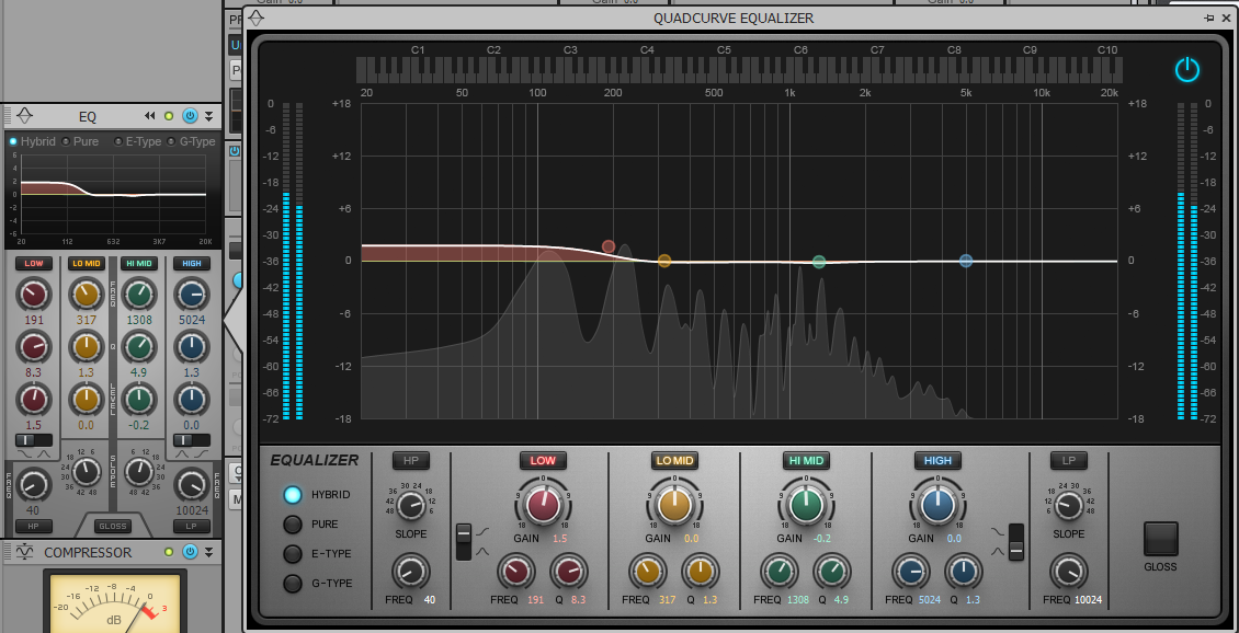
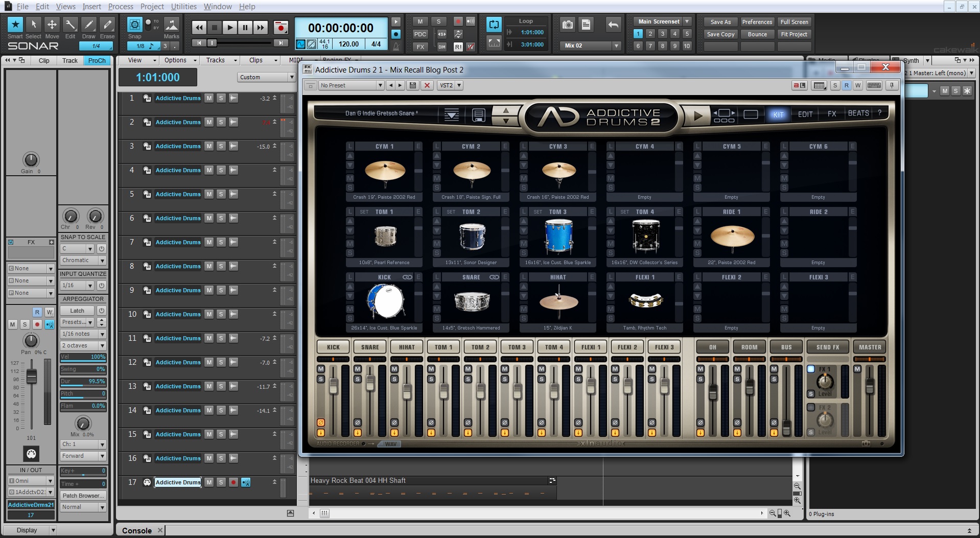
SONAR Platinum, Professional, and Artist have now optimized the way we handle VST plugin windows. Now in the user interface they will cycle through clicked VST plugins so that the interface isn’t cluttered with unused windows.
Continue reading “The New SONAR: Better Design in all 3 versions”


